Portola Valley Interior Design Installation
This home was designed for a couple with the flexibility to accommodate visits from family and to entertain sizeable groups. The clients were wellness-focused; in addition to a home gym, spaces were specifically created for meditation. A peaceful art studio with panoramic views of Portola Valley was included to provide a quiet retreat. Although large, the home was designed to be unobtrusive and it integrates considerately with the surrounding neighborhood. The elegant unification of landscape, architecture, and interior design was paramount is achieving the fluid transition between the indoor and outdoor spaces as well as harmony with the natural surroundings.
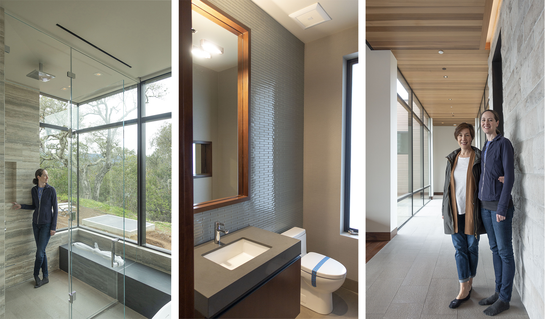
To bring this dream to life, SB Architects created an amazing virtual reality model of the home that allowed the client and the design team to experience the architecture. It was exciting and helpful for the entire team to visualize the design in this way; in retrospect, it was remarkably accurate to the experience of walking through the completed project. The clients particularly responded to visual presentations to understand the design. With this in mind, the interior design team presented many of the interior architecture details using 3-D models for visualization. This was helpful in finalizing details of the Master Bathroom, which featured a stone bench that ran continuously through the shower enclosure, behind the freestanding bathtub, and through the water closet. 3-D renderings were also utilized in the design and scale of the custom decorative lighting as well as to present alternative finishes for the kitchen and examining the built-in cabinetry in the Media Room and Living Room. These digital presentations were combined with trays of physical samples and presentation boards mounted with the finish samples.
The interior design began as a blank slate. To a certain extent, the clients wanted it to remain that way. They wanted an understated interior inspired by luxury hospitality, focusing on the richness of the materials and dramatic lighting. They planned to acquire their art and accessories in time as the right pieces found them; the color and interest of the home would come from their art and accessories, not be dominated by the furniture and lighting. A palette emerged of subtle grey fabrics and warm metal finishes that complimented the raw steel, stone, and woods of the structure. The furnishings played with a range of finishes from deep wood grains to smooth glossy lacquered surfaces, plush mohairs, and soft woven fabrics added a comfort and warmth. Christian Liaigre Grené leather was used throughout for its exquisite embossed finish and its range of colors which beautifully fell within the neutral color scheme.
One of the defining features of this project is the seamless transition from indoor to outdoor spaces. The exterior glass walls that contain the Living Room, Kitchen, and Dining Room almost disappear. These rooms visually shared an open plan at all times; when the sliding glass is folded back giving way to the expansive outdoor deck and pool area, these spaces physically experience an open plan. For this reason, careful consideration was given to the flexible space plan and the consistency of the materials palettes throughout these areas. The Living Room was furnished with a pair of swivel lounge chairs and a sectional with a backless portion to open the seating arrangement and encourage a graceful flow between the interior and exterior spaces. By design, this home is ideal for outdoor living and entertaining.
The dining room was particularly challenging because it was framed on three sides by two glass walls that slid open and a single solid wall punctuated with an HVAC grille at the base board, an air return above, and a large awkwardly placed access panel that a console could not conceal. It was not ideal for a feature wall of the room. Air circulation needed to be maintained and the access panel had to remain accessible. This problem was resolved with the design of a sliding screen of Sapele Mahogany and steel rods executed by Phoenix Woodworks. The screen was positioned sufficiently off the wall to allow adequate ventilation of the air return and grille while strategically concealing them behind the frame of the screen. The access panel could easily be reached since the screen slid on a track was recessed in the ceiling and guided by a small channel in the floor. The slats of Sapele Mahogany were placed at a tight interval to make the access panel behind less noticeable. The simple modern design was in keeping with the client’s love of Asian art and furnishings and the screen was intended to showcase a painting at some point in the future. The screen designed to conceal unsightly elements ultimately became elegant focal point of the room.
McEwen Lighting Studio in Berkeley produced the pair of custom Aureole chandeliers for the living room and dining room. Although the two rooms were separated by an outdoor family room, the sliding glass walls that partitioned the rooms gave a direct line of sight between the two chandeliers. A strong relation between the two spaces was achieved through architectural materials and decorative lighting. The dining room chandelier was 40” diameter, but 14’-6” ceiling height of the living room called for a 52” diameter ring. The exterior of the rings had a faceted surface in a deep dark brown with gloss lacquer finish; while the interior of the rings, featured mirror polished gold reflectors behind facetted opal glass to provide a subtle layer of luxury.
Some of the bespoke furnishings designed for this residence included a bedframe to accommodate the clients’ split pair of ProMotion adjustable beds; a custom quad bunk for the grandchildren with integral bookshelves, charging stations, and individual reading sconces; and a custom 350 lb. smoky cast glass and bronze coffee table by Chai Ming Studios. Additionally, we customized the dimensions of many of the furnishings to fit the proportions of these spaces. A luxurious SHIIR wool and silk rug, hand woven in Nepal with a subtle dark to light grey ombré was scaled to fit the Living Room. We also worked with Bright Chair Company to create an intimate U-shaped sectional for the Media Room that fit perfectly wall-to-wall.
I remember my first visit to the jobsite exploring the small, modern, though sadly dilapidated house with a remarkable view. With this humble origin in mind, the transformation to this elegant residence was awe inspiring. Upon completion, the entire project team came together to celebrate this successful collaboration and culmination of three years of vision, planning, design, and construction. The glass walls were all pushed open to the back terrace, the warm air of the September evening drifted through the house, and the sun slowly set in a dramatic palette of deep pinks mirrored across the surface of the of the infinity pool blurring the line between the water and sky. The dim lighting came up in the house and landscaping creating a truly magical environment to gather and mingle. We all realized that we achieved our goal. I am grateful for the privilege to have worked with Lorissa Kimm, Architect on the interior design of this amazing project.
I was delighted to learn that this Portola Valley House, California was presented with the Grand Award for ‘Best Custom Home, 4,000-6,000 sqft’ in PCBC’s 2020 Gold Nugget Awards. This year, winners were chosen from 575 entries from around the world. Now in its 57th year, the Gold Nugget Awards is the largest and most prestigious competition of its kind in the nation. Selected by a panel of top industry experts and presented virtually on July 24th, the awards showcase the most exciting trends in design, planning, and building.
Architect: SB Architects
Landscape Architect: Thuilot Associates
Builder: Ryan Associates


